Table Contents
- Introduction
- Basic Structure of the app
- More About Custom Painter
- The Canvas Area
- Conclusion
Introduction
The CustomPaint widget in Flutter provides a versatile tool for creating intricate and customized designs. With this widget, you can draw lines, rectangles, and various other shapes, giving you granular control over every pixel displayed on the screen.
This project will delve into the process of crafting a custom paint design and incorporating animation to bring it to life.
Get Started
Create the Flutter project:
Open a command prompt or terminal and navigate to the directory where you want to create your project. Then, run the following command:
flutter create project_name
Replace project_name with the desired name of your project.
Open the project in Visual Studio Code:
Once the project has been created, run the following command to open it in Visual Studio Code:
code project_name
This will open the project in Visual Studio Code, where you can start developing your Flutter app.
Basic Structure of the app
First, you need to remove the demo counter in the main.dart files.
First of all, let’s create the basic structure of the app to get started with painting.
import 'dart:ui';
import 'package:flutter/material.dart';
void main() => runApp(MyApp());
class MyApp extends StatelessWidget {
  @override
  Widget build(BuildContext context) {
    return MaterialApp(
      title: 'Flutter Custom Painter',
      theme: ThemeData(
        primarySwatch: Colors.pink,
      ),
      home: MyPainter(),
    );
  }
}
The MyPainter class is a StatelessWidget because it maintains no internal state that changes over time. The build method of MyPainter returns a Scaffold widget, which provides a basic app layout. Inside the Scaffold’s body, the CustomPaint widget is used to draw custom graphics on the screen.
The painter property of CustomPaint should be set to an instance of a class that extends CustomPainter, where you’ll define your custom painting logic.
class MyPainter extends StatelessWidget {
  @override
  Widget build(BuildContext context) {
    return Scaffold(
      body: CustomPaint(
        painter: CustomDraw(), // Replace with your custom painter
      ),
    );
  }
}
Some important properties of the CustomPaint Widget.
Here it is:
- painter – This is used to paint the body before the child
- child – By default, this is used to contain any widget.
- foregroundPainter: The painter that paints after the child.
- Size: if the child is not defined, the size of the canvas is specified
But we have seen two important properties:
- Painter
- Child
Here, I have defined the container as a child, It contains empty space of the entire size of the screen” which is correct. When you use a Container as the child of the CustomPaint widget, it will occupy the entire space of the CustomPaint widget, which in this case is the entire screen. This is because Container widgets, by default, take up all available space unless specific constraints are applied.
So, in this scenario, the Container acts as a placeholder for the custom painting, providing a blank canvas for the painter to draw on. If you want to display other widgets on top of the custom painting, you can nest them within the Container.
More About Custom Painter
Here, the ShapePainter extends from CustomPainter. The CustomPainter is an abstract class that has two override function
- pain
- shouldRepaint
paint()
The paint() method is invoked whenever the custom painter needs to redraw its contents. This can happen when the widget is initially rendered or when its state changes, requiring an update to the custom graphics.
shouldRepaint()
The shouldRepaint() method determines whether the custom painting needs to be updated when a new instance of the CustomPainter class is provided. This typically occurs when the widget’s state changes and a new painter object is created to reflect those changes.
class ShapePainter extends CustomPainter {

  @override
  void paint(Canvas canvas, Size size) {
    // TODO: implement paint
  }

  @override
  bool shouldRepaint(CustomPainter oldDelegate) {
    // TODO: implement shouldRepaint
    return null;
  }
}
These Paint method have two parameters:
- Canvas
- Size
The Canvas Area
Understanding the Canvas Coordinate System
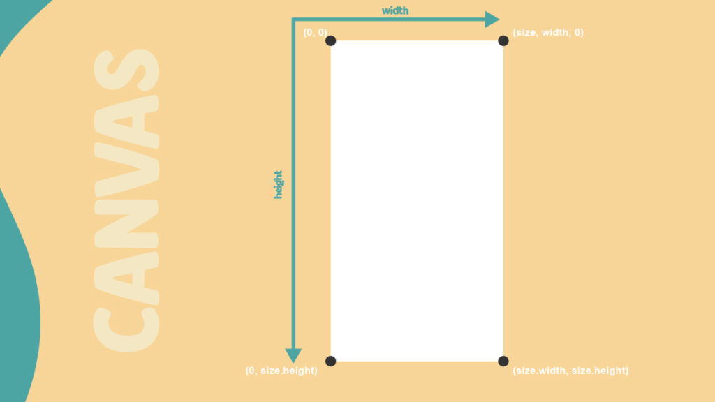
Before drawing anything on the Canvas, it’s crucial to understand its coordinate system. The origin (0, 0) is located at the top left corner of the Canvas. All drawings are positioned relative to this origin.
Drawing a Line
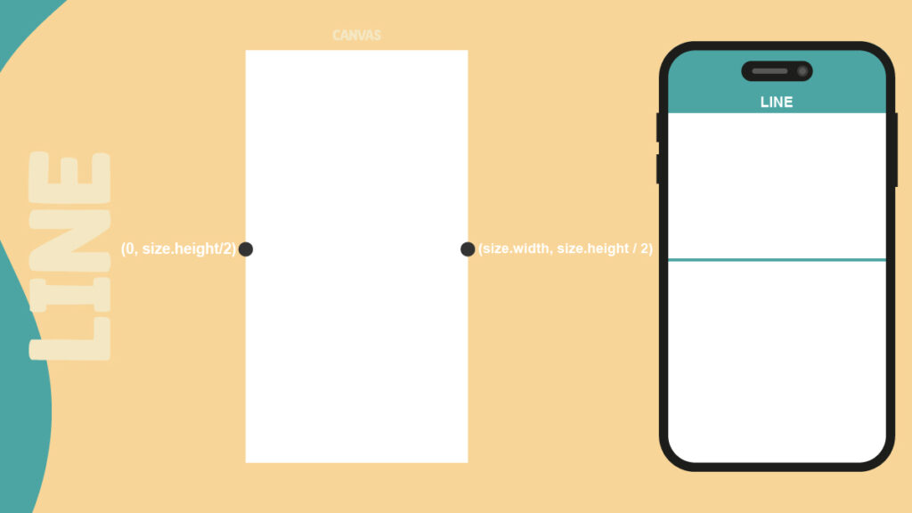
There are two primary methods for drawing a line on the Canvas:
- drawLine() method
- drawPath() method
class CustomDraw extends CustomPainter {

  @override
  void paint(Canvas canvas, Size size) {
    var paint = Paint()
      ..color = Colors.teal
      ..strokeWidth = 5
      ..strokeCap = StrokeCap.round;

    Offset startingPoint = Offset(0, size.height / 2);
    Offset endingPoint = Offset(size.width, size.height / 2);
    canvas.drawLine(startingPoint, endingPoint, paint);
  }

  @override
  bool shouldRepaint(CustomPainter oldDelegate) {
    return false;
  }
}
The drawLine() method takes three arguments: a Paint object, a starting Offset, and an ending Offset. The Paint object acts like a paintbrush, defining the line’s color, stroke width, stroke cap, and other properties. The Offset variables specify the coordinates of the line’s starting and ending points.
The shouldRepaint() method determines whether the custom painting needs to be redrawn when the state of the widget changes. In the case of drawing a static line, you can return false from this method, indicating that no repainting is required. This optimizes performance by avoiding unnecessary redrawing.
Another one is drawPath()
class CustomDraw extends CustomPainter {

  @override
  void paint(Canvas canvas, Size size) {
    var paint = Paint()
      ..color = Colors.teal
      ..strokeWidth = 5
      ..style = PaintingStyle.stroke
      ..strokeCap = StrokeCap.round;

    var path = Path();
    path.moveTo(0, size.height / 2);
    path.lineTo(size.width, size.height / 2);
    canvas.drawPath(path, paint);
  }

  @override
  bool shouldRepaint(CustomPainter oldDelegate) {
    return false;
  }
}
Drawing a Circle
First, we need to find the coordinates of the circle like this
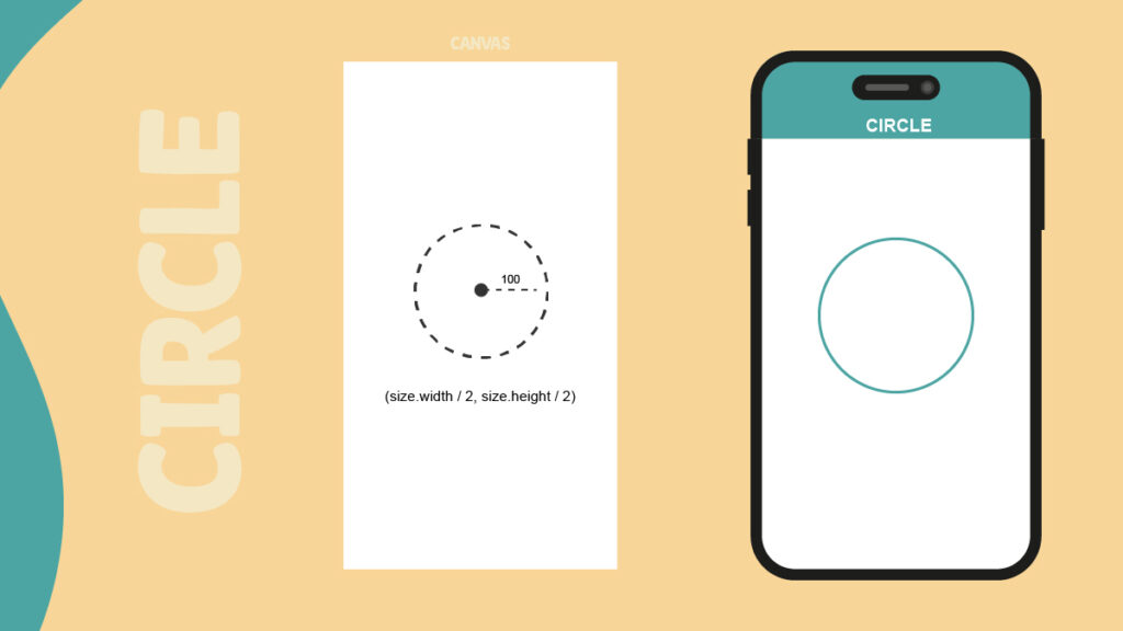
The addOval() method is part of the Path class and is used to add an elliptical arc to the path. When the width and height of the oval are equal, it creates a perfect circle. The addOval() method takes three arguments:
- Rect: A Rect object that defines the bounding rectangle of the oval.
- startAngle: The starting angle of the arc in radians.
- sweepAngle: The sweep angle of the arc in radians.
To draw a complete circle, you can use 0.0 for both startAngle and sweepAngle, effectively covering the entire 360 degrees of the circle.
Once the path is defined with the desired circle shape, you can use the canvas.drawPath() method to draw the path onto the canvas.
The drawPath() method takes two arguments:
- Path: The Path object that defines the shape to be drawn.
- Paint: The Paint object that specifies the color, stroke width, and other drawing properties.
By combining the addOval() and drawPath() methods, you can effectively draw circles on the canvas with precise control over their position, size, and appearance.
class CustomDraw extends CustomPainter {
  @override
  void paint(Canvas canvas, Size size) {
    var paint = Paint()
      ..color = Colors.teal
      ..strokeWidth = 5
      ..style = PaintingStyle.stroke
      ..strokeCap = StrokeCap.round;

    var path = Path();
    path.addOval(Rect.fromCircle(
      center: Offset(size.width / 2, size.height / 2),
      radius: 100,
    ));
    canvas.drawPath(path, paint);
  }

  @override
  bool shouldRepaint(CustomPainter oldDelegate) {
    return false;
  }
}
Drawing a Polygons
The best method to draw a polygons using circle reference and find the coordinate using the angle, which can determine the basic trigonometry
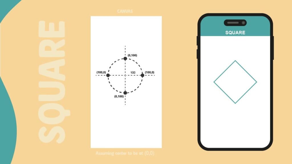
A square can be drawn by connecting four points that are equally spaced around a circle’s circumference. To achieve this, we can divide the total angle of a circle (2π radians) into four equal parts, each representing a corner of the square.
The starting point coordinates for the first corner can be calculated using the formula (r * cos(0.0), r * sin(0.0)), where r is the radius of the circle. In this case, since the radius is 100 pixels, the starting point coordinates are (100.0, 0.0).
However, we want to draw the square relative to the center of the canvas, so we need to add the coordinates of the center to the calculated coordinates to determine the correct position for each corner.
By iterating through the four equally spaced angles and calculating the corresponding coordinates, we can connect the points to form the square shape.
var path = Path();
var angle = (math.pi * 2) / sides;

Offset center = Offset(size.width / 2, size.height / 2);
// startPoint => (100.0, 0.0)
Offset startPoint = Offset(radius * math.cos(0.0), radius * math.sin(0.0));
path.moveTo(startPoint.dx + center.dx, startPoint.dy + center.dy);

for (int i = 1; i <= sides; i++) {
  double x = radius * math.cos(angle * i) + center.dx;
  double y = radius * math.sin(angle * i) + center.dy;
  path.lineTo(x, y);
}
path.close();
Adding some animation
Now, we add some animation in polygons. Let’s follow the steps to animate the polygons
Step 1: First of all, we need to convert the MyPainter Widget to StatefulWidget, and extend it to the TicketProverStateMixin.
Step 2: Declare the two variables
Animation<double>? animation;
AnimationController? controller;
Step 3: An infinite rotation is achieved by applying Tween from –π to π
Tween<double> _rotationTween = Tween(begin: -math.pi, end: math.pi);
Step 4: To achieve an infinite rotation, initialize the controller and animation variable within the initState method and repeat the animation upon completion.
@override
  void initState() {
    super.initState();

    Future.delayed(Duration.zero, () async {
      controller = AnimationController(
        vsync: this,
        duration: const Duration(seconds: 3),
      );

      animation = _rotationTween.animate(controller!)
        ..addListener(() {
          setState(() {});
        })
        ..addStatusListener((status) async {
          if (status == AnimationStatus.completed) {
            await controller?.repeat();
          } else if (status == AnimationStatus.dismissed) {
            await controller?.forward();
          }
        });

      await controller?.forward();
    });
  }
Step 5: Add the wrap to the AnimatedBuilder in ShapePainter
AnimatedBuilder(
            animation: animation,
            builder: (context, snapShot) {
              return CustomPaint(
                painter: Polygon(
                    sides: 4,
                    radius: 100,
                    animationValue: animation?.value ?? 0),
                child: Container(),
              );
            })
Step 6: Pass the animation value in radians
Conclusion
Finally, you can play with your paint using animation. if you need to know about anything in Flutter Please comment below section.
The source code is available on GitHub and if you have any doubts just comment below.
Subscribe to our email newsletter to get the latest posts delivered right to your email.

Comments